![]()
Photography by T. L. "Tom" Cubbage II
This page is about the creation of this website.
![]()
"Tom's Virtual Gallery Design Concept"
The Basic Concept
Fine-art photography is about doing (the making of the images) and showing (their exhibition). I live in Bartlesville, Oklahoma, in the Heartland of America; well away from the great centers of photographic art. Pages on the Web offers me the opportunity to show my work, and that of guest artists, to the world.
I like to shoot outdoors in New Mexico. I also like to visit the small galleries in Santa Fe. Most are in old houses with small rooms: some with their interconnected rooms are like rabbit warrens. But, within each room it is possible to display a small collection of images. By limiting the number of photos that a viewer is exposed to at any given time, these small gallery room allow the visitors to take a really good look at each image, and to compare one with another.
I decided to use the electronic magic of the world wide web to create my own Santa Fe-style gallery. My virtual gallery also has lots of rooms. Hopefully, within my room-like pages, the casual visitor will find images that stir the imagination and emotions. I have a personal way of seeing the world. Hopefully what I see, record, and now present, will inspire and move others to create with photography, or to collect photo art.
The Accompanying Words
If you go to a regular gallery there is usually some text accompanying the images. Often there are explanations of the grouping of photos in a particular room. The pages of my website are like the rooms in the gallery, and more than just captions accompany the images. Some people think that you ought to simply show a picture and let the viewer make of it what they will. I don't belong to that school of thought. I like to know a little bit about what a photographer was up to when he or she produced a photo, or series of images. I think that one can get more content through knowing a context.
My pages open with a few words about the images on the page. Since the words are at the top of the page, they are there to be read as the image files are loading. Some have described my style as "chatty," and that is fine with me. A gallery should be a friendly place for people to gather. I try to answer some of the many questions that I think a viewer might ask if we were to meet at a real gallery.
The Images
I looked at a lot of websites before deciding what to do about displaying the images. Several considerations weighed in my final decision.
First, and foremost, was an underlying design consideration. I wanted my virtual gallery to have the feel of a real gallery with lots of small rooms. I also wanted to limit the number of images per page and group them in logical ways as if they were hung in a real gallery. Four to twelve images per pages seemed like the outside limits, and six to ten images per page is just about right.
Second, in keeping with the room/page design consideration I decided in the main to have all the images in full viewing size on the page. Thumbnails linked to larger images are useful in some instances, but they are not for me (there may be a few exceptions to this rule). I also don't like pages that take you through a series of pictures by the use of a "next" button.
Third, I determined that if I sized a photo so that its actual size was not more than 6-inches high or wide (at 72 pixels per inch), then both the top and bottom of the image would be fully visible at the same time. After viewing an image the viewer can scroll down slightly and see my caption. After an image and caption are viewed the observer can then scroll to the next one. Best of all, one can go back and forth to all the images on the page with ease. Samples of my photos, in portrait and landscape format, with captions, are shown below to illustrate how they look on the page.
Fourth, I wanted the pages to load reasonably fast. I assumed that by 2001 most people will have or soon be using modems with a speed of at least 56 Baud. To assure a fast load I limited the number of graphic element per page and keep the image file size down. By experimenting I found that I could get a good image from a file that was from 25 to 50 Kb in size, and I try to compress the files to between 30 to 50 Kb in size.
Fifth, and this is something new as of May 2005, I will begin to do some experimenting with photo slide shows created using the automated procedures available in Photoshop. I will consider pages that have a regular format, and a slideshow option that will offer many more images alond the same line as the others on a page.
In some instances it may be important to show a photo in a larger size. When those times come, a hyperlink to a larger image will be provided. And who know, I may even start showing images that a larger in size.
Keeping photos small in both actual and file size also provides a fairly reasonable guard against unfair use. If someone wants to make a copy of an image for their personal reference use they easily can do so, and copying several images will not require much hard drive space. However, if someone copies an image file and tries to enlarge it, the image literally comes apart. If a person really wants to use one of my images for a legitimate purpose they can contact me and we can work out an arrangement that will give them a file in a usable size and provide some form of reasonable compensation to me.
The Background
I wanted my site to have a Southwestern or Santa Fe feeling. Nothing is more in keeping with that ambiance than a nice tan stucco. Tan is a restful color and I like the textured look of the page. On those pages with lots of text (other than this one) I use a white or gray background.
Font Display
I like a font that is easy to read. The lettering on this page is an Comic San MS font in 14-point bold. Against the tan stucco background anything less than 14-point bold seemed just too hard to read.
Miscellaneous Stuff
Internal links are important and I provide hyperlinks to the top of every page, and to the Home and Introduction pages, an the four table of content pages. I also provide additional dynamic links to other pages in a series and to other relevant pages in the site.
An artist needs feedback. I think that it ought to be easy to contact the person whose work is displayed on a page. For that reason I put a dynamic e-mail icon on every page. I also include the statement "I am looking forward to hearing from you." I read my mail and learn from it, so don't be hesitatnt about writing me.
Until early 2004 I used Microsoft FrontPage™ 2000 (ver. 4.0) to create my pages. It is easy to use and powerful enough to do all that I wanted to accomplish and then some. I have foregone the option of utilizing frames; they have their place, but not on these pages (at least none I have created to date). Today I use Macromedia Dreamweaver MX 2004, which is a bit more robust a program.
If a page is important enough to merit publishing, I think it ought to have a URL code on it. If it does, and it is printed, a reader of the printed page can find their way back to the page on the web.
I think it is important to know when a page was first published and when it was updated, so that information is shown on every one of my web pages.
I used to think that if an artist/webmaster is going to get an understanding of what is going on at their virtual gallery website, they need to be able to monitor the traffic flow to and within the site. In the beginning I put a counter on every page which allowed for flow monitoring. By the middle of 1998 there were over 10,000 visits to this site and I decided to remove the counter. By then it was apparent to me personally that the only visits I cared about were those where a viewer took a moment and sent me a thoughtful note giving their impressions (or placing an order for a print). It's the number of interesting notes per day that really count. Today I do get statistical reports from my host, which allow me to better understand what pages are getting traffic, but I still like to get viewer feedback.
In the 1997-2003 era, where a page contained mainly text I also added a background instrumental sound file to the page. In 1997 I found a site with an keyboard artist that has midi-format files of almost every song that Enya has written. I liked Enya's work and so I picked a few favorites and added them as background music. In 2004 I dropped the sound files. Today, if a person wants music with their images they can pop a disk in their CD player or listen to an iPod, and get the music of their choice.
The Perfect Concept?
Have I created the perfect website? I doubt it, but, I have created the one that I believe is best suited for what I want to show and how I want to show it. I hope it is a place where you as a visitor feel comfortable and find something of visual value. I also hope that there is enough information to make it a place for learning. Other artists have taught me much by allowing me to see not only what they have done, but also by telling a little about how they did it. I hope I can do the same for others.
I am proud to say that early on this site won several awards. I am equally pleased with the many kind notes from visitors during the first five years: please see my Viewer's Comments Page.
Photographic Examples: How They Look On The Page
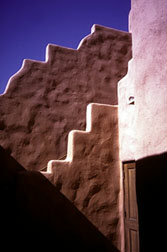
"Architectural Detail, La Posada de Santa Fe"
(Santa Fe, NM. Jul., 1996) (SF179515.jpg)
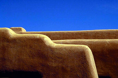
"Architectural Detail, Fatima Hall"
(Santa Fe, NM. Jul., 1996) (SF073802.jpg)
All images: Copyright 1997 by T. L. "Tom" Cubbage II - All Rights Reserved
Click here to go to the top of this page
Click here to go to go back to my Home or Intoduction pages.
Click here to go to my General Index or Portfolio Index or Guest Artist or Links pages
I am looking forward to hearing from you.
The URL for this page is: http://www.tomcubbage.com/design.htm.
This page was first published 12/10/1997.
Updated 5/2/2005, at 12:30 hours CST, by Webmaster Tom Cubbage